Color grading tips for cohesive photobooks
Consistent color grading ties together photos taken at different times and places into a unified visual story.
By the Studio6 min read
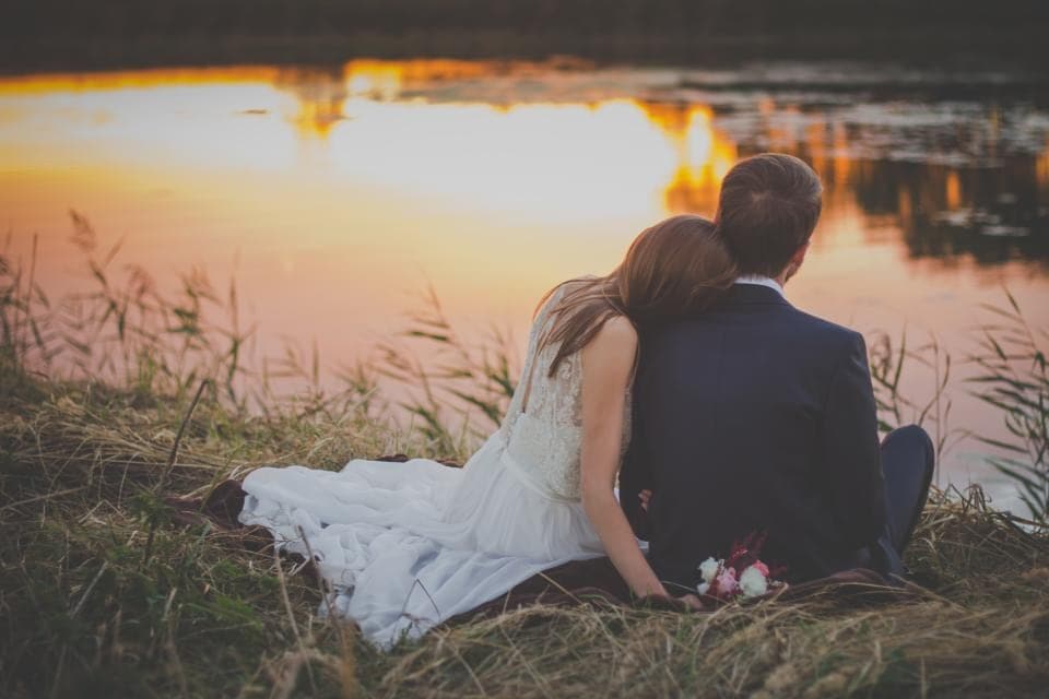
Photos in a family book come from everywhere: an old phone, a new phone, a cousin's camera, a scanned print. Each one has its own colour, brightness and mood. Placed side by side, they can look like pages from different books. Colour grading is the gentle art of making them belong together.
What is colour grading?
Colour grading means adjusting the overall colour and tone of a photo to create a particular mood. Correction fixes problems, such as a blue cast or a dark exposure. Grading adds character, such as warmth, softness or contrast. For photobooks, the most important goal of grading is consistency.
Why does consistency matter in print?
On a phone, you see one photo at a time. In a book, you see two pages at once, often with several photos on each. Differences in warmth or brightness that you would never notice on a screen become obvious when photos sit next to each other. A consistent grade makes the book feel calm and intentional.
How do I choose a look?
Pick one photo you love that represents the feeling of the book. A warm, golden afternoon. A cool, misty morning. A bright, clean summer day. Use that photo as your reference and adjust others towards it. You are not trying to make every photo identical, only to make them feel like they come from the same world.
Which adjustments matter most?
- Temperature. Warmer or cooler. This has the biggest effect on mood.
- Tint. Green or magenta. Small changes fix strange skin tones.
- Contrast. Higher feels punchy, lower feels soft and nostalgic.
- Saturation. How intense colours are. Keep it moderate for print.
- Shadows. Lifting them slightly gives a softer, film-like feel.
Should I use presets or filters?
Presets can save time, but they work best as starting points. The same preset looks different on a photo taken in daylight and one taken under a kitchen bulb. Apply it, then adjust temperature and exposure for each photo so they actually match.
How do I grade old scanned photos?
Old prints often have faded or shifted colours, such as yellow whites or orange skin. Correct the worst of it so faces look natural, but do not try to make them look brand new. A slightly warm, soft grade suits old photos and honours their age. You can also gently match newer photos towards that warmth on spreads where old and new appear together.
Is black and white a good option?
Converting a whole chapter or even a whole book to black and white is a powerful way to unify very different photos. It removes the colour mismatches entirely and puts the focus on faces, light and emotion. Make sure the result is truly neutral, without a faint colour tint, which becomes visible in print.
Keep it gentle
The best grading is barely noticeable. If someone looks at a page and thinks about the editing, it has gone too far. If they simply feel that the book is beautiful and calm, the grading is doing its job.