How to use negative space in photobook design
Strategic use of empty space can make your photobook pages feel elegant and intentional.
By the Studio5 min read
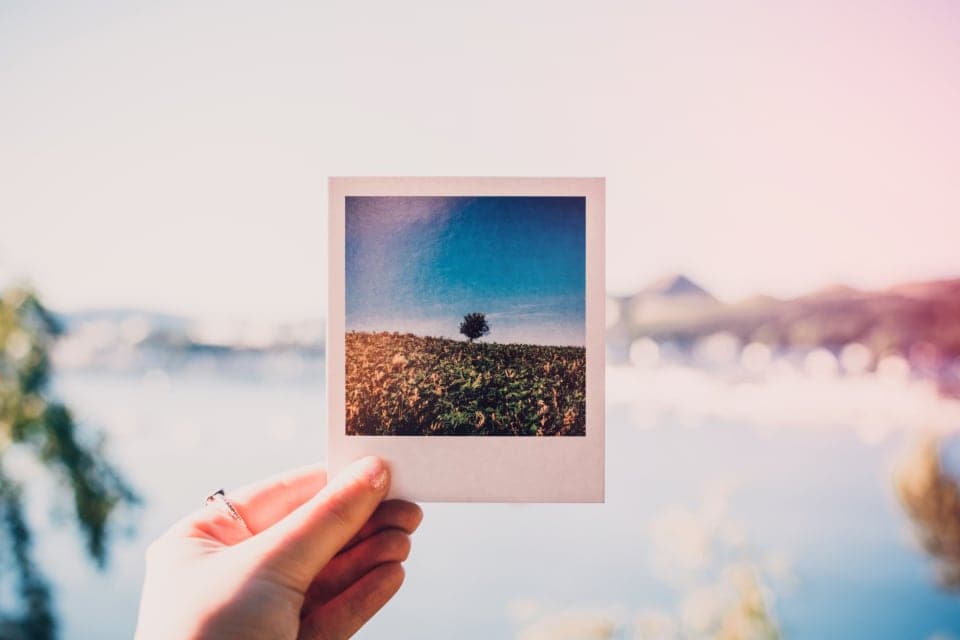
Negative space is the area around and between the things on a page. In a photobook, it is the empty paper around a photo, the air between two images, and the quiet area inside a photo itself, such as sky, sea or a plain wall. Used well, it is one of the most powerful tools a designer has.
What is the difference between negative space and white space?
They are closely related. White space usually refers to empty areas of the page layout, such as margins and gaps. Negative space is a broader idea: any empty area that surrounds a subject, including empty areas inside a photo. A small figure standing in a large empty field is a photo full of negative space.
Why does negative space feel elegant?
Empty space signals confidence. It tells the reader that the designer chose what to include and was comfortable leaving the rest out. It slows the eye down and focuses attention on what remains. High-end magazines and art books use generous negative space for exactly this reason.
How can I use negative space inside photos?
Choose photos where the subject has room around it. A person framed against a large sky, a cup on an empty table, a child at the edge of a lake. These photos work beautifully as full pages, because the empty area gives you a calm place to set a title or a short caption without covering anything important.
How can I use negative space in the layout?
- Place a single small photo in the middle of a large page.
- Align a photo to one corner and leave the rest of the page empty.
- Leave one page of a spread completely blank, or with only a line of text.
- Use generous, consistent margins around every photo.
When is negative space too much?
When it starts to feel like something is missing rather than intentionally left out. A page of empty space with no clear focal point can feel unfinished. The trick is contrast: the empty area should make one element feel more important, not leave the reader wondering what was supposed to be there.
Negative space creates pace
A spread full of photos is fast. A spread with one small image is slow. Placing a quiet page after a busy section gives the reader a breath and makes the next big moment land harder. Think of negative space as the pause between sentences.
Start small
If you are new to designing with space, try this: in your next book, choose three moments that matter most and give each one a page with a single photo and generous margins. Notice how often people stop on those pages. That is negative space at work.