A minimalist approach to photobook design
Sometimes the most powerful photobooks are the ones with the fewest elements on each page.
By the Studio5 min read
There is a quiet kind of photobook that people linger over longer than any other. Each page holds one photo, maybe two. There is plenty of paper around them. A single line of text appears now and then. Nothing shouts, and because nothing shouts, every photo is heard.
What is minimalist photobook design?
It is the practice of removing everything that is not essential. Fewer photos, fewer fonts, fewer colours, fewer decorations. What remains is given space and attention. Minimalism is not about being empty or cold; it is about being deliberate.
Why does minimalism work so well in print?
On a screen, minimal design can feel sparse. On paper, it feels luxurious. Empty space on a heavy page has texture and presence. A single photo in the middle of a large page draws the eye immediately and holds it. Readers slow down, because there is nothing else competing for their attention.
How to design a minimalist photobook
- Choose fewer photos. Be ruthless. Every image should earn its place.
- One photo per page, most of the time. Use grids rarely and with purpose.
- Generous margins. Let the paper frame each image.
- One typeface. Use size and weight for hierarchy instead of mixing fonts.
- Neutral colours. White, cream, grey or black backgrounds keep focus on the photos.
- Short text. A title, a date, a few captions. Let images carry the story.
What photos suit minimal design?
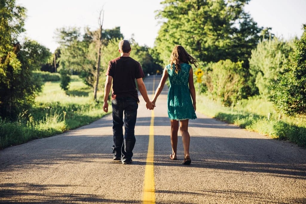
Photos with a clear subject and a calm background: a portrait against a plain wall, a hand holding a cup, a figure walking along an empty road. Busy scenes can still work, but give them extra space so they do not overwhelm the page.
Isn't it a waste of pages?
It can feel that way at first. But a minimalist book is not about using every centimetre. It is about creating a feeling: calm, focus, respect for the moment. People often say minimalist books feel more expensive and more emotional, precisely because so much has been left out.
When minimalism is not the right choice
Some books are meant to be joyful and busy: a child's birthday, a festival, a crowded wedding. Those stories can benefit from energetic collages and full spreads. Even then, a few minimalist pages scattered through the book provide welcome rest and make the busy pages feel more alive.
A small experiment
Take your favourite ten photos from a recent trip or event. Place each one on its own page with nothing else. Look at them together. You might find that you need very little else to tell the story.