Designing a portfolio book for creatives
A printed portfolio commands attention in a way that a website link in an email cannot.
By the Studio6 min read
A link in an email competes with every other tab a person has open. A printed portfolio placed on a table has the room to itself. Photographers, illustrators, architects, stylists and designers all benefit from a physical book, not because it replaces a website, but because it creates a moment of full attention that a screen almost never gets.
How many projects should a portfolio book include?
Fewer than you want to. Eight to twelve strong projects are usually enough, and some of the best portfolios show only five. Every weak piece dilutes the strong ones, because a reviewer judges you by the least convincing page. If you hesitate about a project, leave it out.
How should I order the work?
Open with your strongest piece and close with your second strongest. People remember beginnings and endings best. In between, vary the pace: follow a busy project with a quiet one, a colourful series with a monochrome one. If you want to be hired for a specific kind of work, put the most relevant projects in the first third of the book.
What layout works best for a portfolio?
Consistency is what makes a portfolio look professional. Choose a simple grid and keep it for the whole book. Give each project an opening spread with one hero image and a short title, then two to four pages of supporting images. Keep text to a minimum: a project name, a client or context, your role and a year. Let generous margins and a calm background frame the work.
Should I use full bleed images?
Use them sparingly, for the images that can carry it. A full bleed photograph is a statement, and too many statements in a row become noise. Most portfolio pages look stronger with a white margin around the work, because it signals that each piece has been chosen and placed deliberately.
What size and format should a portfolio be?
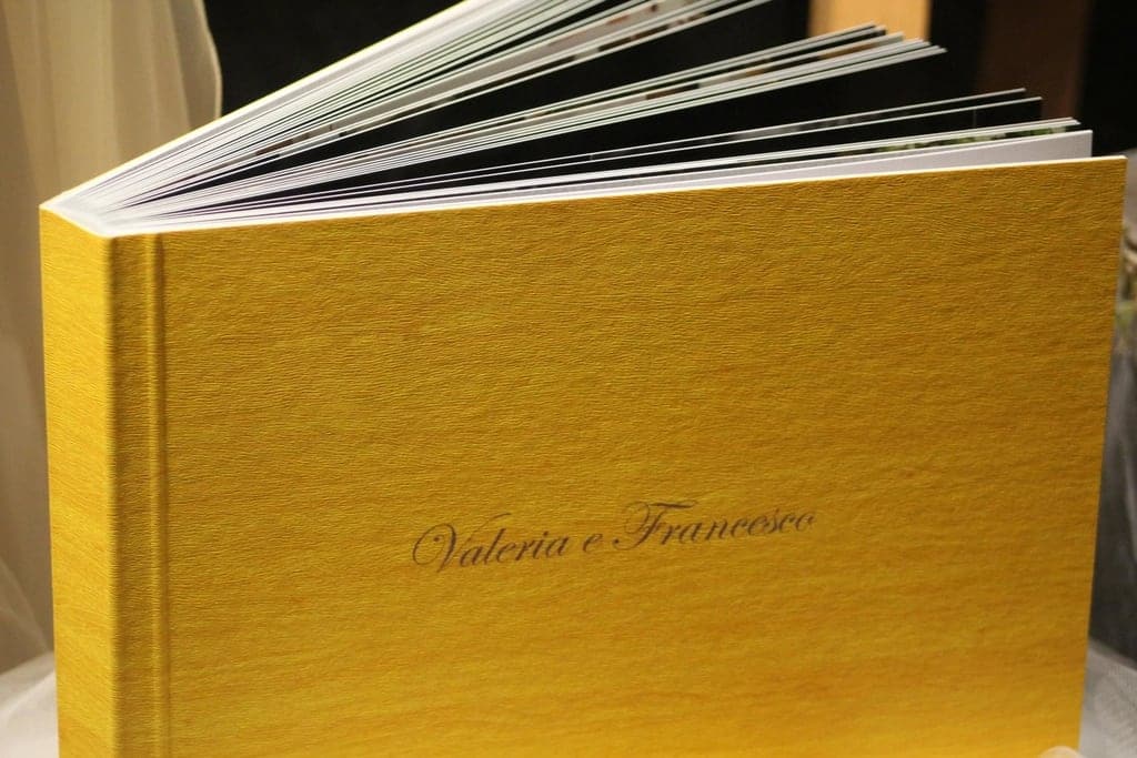
Choose a size that is easy to carry to a meeting and comfortable to hold in a lap. Landscape formats suit photographers and anyone with wide work. Portrait formats suit fashion, illustration and editorial work. Lay-flat binding is worth it if any image needs to cross a spread. A hardcover protects the book through many meetings.
Paper and finish
Matte or silk paper keeps reflections away when someone is looking at your work under office lights. If your work is dark or highly saturated, silk holds deep colour better. If it is soft, natural or textual, matte or uncoated paper gives it a refined, quiet feel.
How do I keep a portfolio current?
Design it so pages can be swapped in a new edition without rethinking the whole book. Keep a master file with your best work, and update the book every six to twelve months. Many creatives keep a short edition for meetings and a longer one as a personal archive.
A final check before printing
- Does every project earn its place?
- Is the first spread the strongest thing you have made?
- Can someone understand what you did on each project in one sentence?
- Do the images look right at the printed size, not just on screen?
A good portfolio book says, without words, that you know how to edit your own work. That is often the skill a client is really hiring.