How to pick a paper finish for your photobook
Matte, glossy, or uncoated: the paper you choose shapes every photo in your book.
By the Studio5 min read
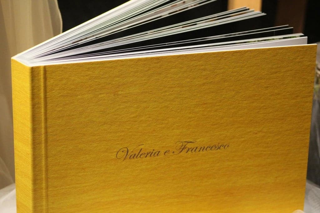
You have spent weeks curating photos, adjusting colors, and settling on a layout. But the paper finish you choose will change everything about how those images land. It is the last decision in the design process and one of the most important. Paper is where ink meets light, and that meeting determines whether your photos feel vivid, soft, editorial, or timeless.
Let us walk through the three most common finishes and when each one earns its place in your photobook.
Glossy: high contrast, high drama
Glossy paper has a reflective coating that makes colors pop. Blacks look deeper, whites look brighter, and the overall contrast of every image increases. If your photobook is heavy on landscapes, street photography, or bold color palettes, glossy stock brings energy to the page.
The trade-off is glare. Under direct light, glossy pages can reflect so much that details disappear behind a white sheen. Readers instinctively tilt the book or shift in their seats to find an angle that works. This is not a dealbreaker, but it is worth considering if you imagine people flipping through your book in a sunny room or under overhead lighting.
Glossy finishes also show fingerprints more readily. For a book that will be passed around at a family gathering or left on a coffee table, smudges can accumulate fast. Some printers offer a silk or semi-gloss finish that splits the difference: less reflective than full gloss, but still more vibrant than matte. If you want punch without the mirror effect, ask your printer about this middle ground.
Best for: vibrant color work, travel photography, product portfolios, any project where contrast is a priority.
Matte: quiet, tactile, editorial
Matte paper absorbs light rather than reflecting it. The result is a softer image with less contrast and a gentle, almost chalky texture under your fingertips. Matte finishes are a favorite in the editorial and fine-art world because they give photographs a calm, contemplative quality.
The lower contrast means that shadow detail is easier to read, which is a real advantage for black-and-white photography or portraits with subtle tonal shifts. You lose a bit of saturation compared to glossy, but the payoff is that images feel more grounded and natural.
Matte paper is also more forgiving in different lighting conditions. There is no glare to contend with, so readers can view the page from any angle without reflections getting in the way. Fingerprints are less visible, and the pages feel sturdy and premium.
One thing to watch: if your images are already low in contrast or rely on deep blacks, a matte finish can flatten them further. Consider boosting contrast slightly in your files before sending them to print. A small curves adjustment can preserve the richness you want while keeping the matte feel.
Best for: black-and-white photography, portraits, fine-art projects, editorial layouts, and any book that will be handled often.
Uncoated: raw, warm, organic
Uncoated paper has no coating at all. It is the stock you think of when you imagine a high-end literary journal or an indie zine. The surface is soft and porous, and ink absorbs into the fibers rather than sitting on top. This gives images a warm, slightly muted character that feels handmade and intimate.
Because the paper absorbs more ink, colors shift noticeably. Bright reds may lean toward brick tones, and blues can feel more subdued. This is not a flaw; it is part of the aesthetic. But it does require you to calibrate your expectations and, ideally, request a printed proof before committing to a full run.
Uncoated stock is wonderful for projects that lean into texture: mixed-media books, journals that combine photography with hand-lettering, or story-driven albums where the tactile experience matters as much as the visual one. The pages have a warmth that coated papers simply cannot replicate.
The practical concern is durability. Uncoated paper stains more easily and is more susceptible to moisture. If longevity is a priority, consider pairing uncoated interior pages with a coated or laminated cover to protect the book over time.
Best for: personal journals, story-driven albums, mixed-media projects, and books where a handcrafted feel is the goal.
How to decide
Start with the mood you want your reader to feel when they open the book. Energized and impressed? Glossy. Calm and thoughtful? Matte. Warm and intimate? Uncoated.
Then consider the content. High-saturation images with bold colors reward a glossy or semi-gloss finish. Subtle tonal work, especially in black and white, sings on matte. Projects that mix photography with text, illustrations, or handwritten elements often land best on uncoated stock.
Finally, think about how the book will live in the world. A coffee-table showpiece benefits from fingerprint-resistant matte. A portfolio you hand to clients might want the visual punch of glossy. A gift album for a close friend could feel most personal on uncoated paper.
If you are still unsure, order paper samples or a single proof copy before committing. Holding the stock in your hands and seeing your actual images on it is worth more than any description. The right paper does not just display your photos; it becomes part of the story they tell.