How white space makes your photos breathe
Generous margins and empty areas guide the viewer's eye and give each image room to shine.
By the Studio5 min read
The most common instinct when designing a photobook is to fill every page. You have so many good photos, and empty paper feels wasted. But the books that feel calm, expensive and memorable almost always have more empty space than you expect. White space is not wasted space. It is what lets the photos be seen.
What is white space in a photobook?
White space is any area of a page without images or text. It does not have to be white; it can be cream, grey or any background colour. It includes margins around the edges, gaps between photos and larger empty areas that frame a single image.
Why does white space make photos look better?
Our eyes need somewhere to rest. When photos are packed edge to edge, they compete with each other and none of them stands out. When a photo sits on a page with generous space around it, the eye goes straight to it and stays there. White space also signals care: it tells the reader that each photo was chosen and placed on purpose.
How much margin should a photobook page have?
As a rough guide, outer margins of around a tenth of the page width feel comfortable for most books. Inner margins near the spine should be a little larger than outer ones, so photos do not disappear into the fold. Bottom margins look best when they are slightly larger than top margins, which makes the content feel grounded rather than sliding off the page.
When should I use a single photo on a page?
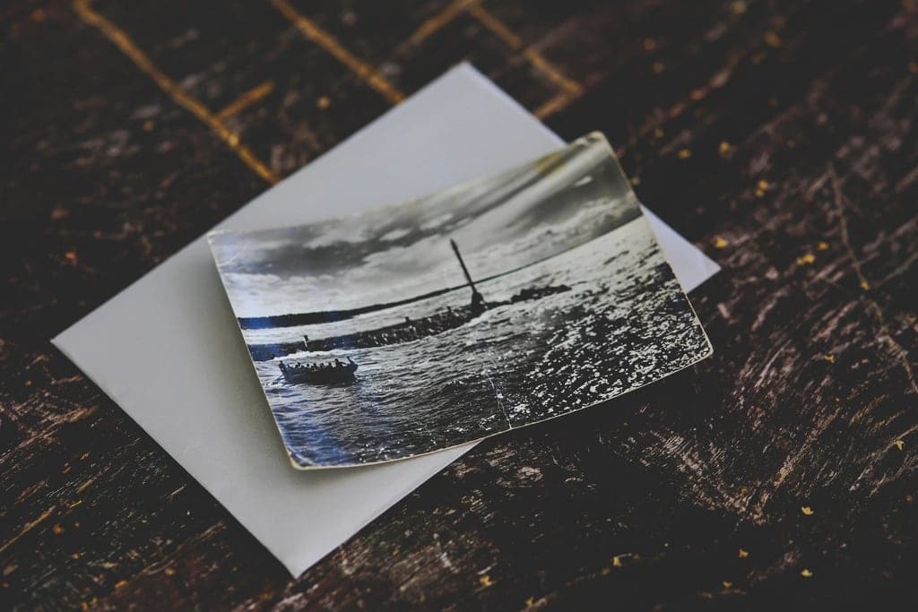
Use a single, small photo with lots of space around it for quiet, intimate moments: a hand, a portrait, a detail. The emptiness around it creates a sense of stillness. This works especially well after a busy spread full of photos, giving the reader a pause before the next chapter.
Can white space and full bleed photos work together?
Yes, and they work best together. A full bleed photo is loud. A page with one small photo and lots of space is quiet. Alternating between the two creates rhythm, the same way music alternates between loud and soft. A book that is all full bleed is exhausting; a book that is all white space can feel cold. The combination is what makes it feel alive.
Keep gaps consistent
The space between photos on a page should be the same throughout the book. Consistent gutters make layouts feel deliberate and organised. Soouvenir layouts keep spacing consistent automatically, so you can focus on choosing photos instead of measuring.
A quick test
Look at a spread and ask: where does my eye go first? If the answer is unclear because everything is fighting for attention, remove a photo or enlarge the margins. If the answer is immediate, the white space is doing its job.
Fewer photos, more room. It feels counterintuitive at first, but once you see a page breathe, it is hard to go back.