The role of typography in photobook design
The right typeface can set the tone of your photobook before a single image registers.
By the Studio5 min read
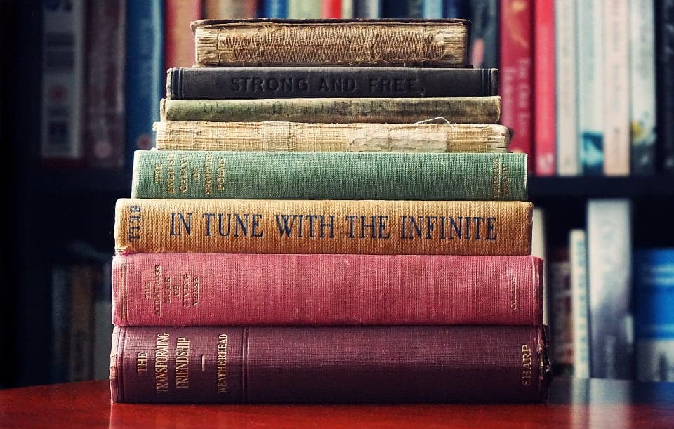
Photobooks are about pictures, so it is easy to treat text as an afterthought. But typography is often the first thing that sets the tone of a book. A title on a cover, a chapter heading, a caption beneath a portrait: each one speaks with a voice, and that voice shapes how the photos are read.
Type has a personality
A classic serif feels timeless and literary. A clean sans serif feels modern and calm. A bold, condensed face feels energetic. A delicate italic feels intimate. The same photo of a couple can feel like a fashion editorial or a family heirloom depending on the typeface beside it.
Hierarchy guides the reader
Good typography tells readers what to read first. A large title, a smaller subtitle, a quiet caption. This hierarchy helps people navigate the book without thinking about it. Magazines are masters of hierarchy, which is one reason a well-designed photobook can feel like a magazine.
Contrast creates elegance
Some of the most beautiful pages pair very large type with very small type. A huge chapter number beside a tiny caption, a bold title above a delicate paragraph. This contrast feels confident and editorial, while type that is all the same size feels flat.
Less is more
Most memorable books use one or two typefaces at most. Consistency allows photos to take centre stage. Adding more fonts rarely adds personality; it usually adds noise.
Type and photos should work together
Let the mood of the photos guide your choice. Soft, warm family photos suit gentle serifs. Crisp architecture suits geometric sans serifs. Black and white portraits often look striking beside a classic serif with lots of white space. When type and photos share a mood, the book feels whole.
Placement matters as much as choice
Where text sits on the page affects how it is read. A caption aligned to the edge of a photo feels connected to it. A title set in the empty sky of a full bleed photo feels integrated. Text floating randomly feels accidental. Align text to the same edges and margins throughout the book to create order.
Let the words breathe
Generous line spacing and short line lengths make text pleasant to read, even in captions. Avoid squeezing words into tight spaces. If text feels cramped, edit it down rather than shrinking it.
Typography you will not notice
The best typography in a photobook is often invisible. Readers will not think about the fonts; they will simply feel that the book is beautiful, calm and easy to read. That quiet feeling is the sign that the type is doing its job.